|
Waiting
For The Warhammer To Fall - In Color
an interview with artist JM Ringuet
|
|
|
In stores
on December 20.
|
This
past summer, we picked up a book from Silent Devil Press
called Death Comes To Dillinger. The artwork was what really
caught our attention, Mark Teague and I spent a lot of time
poring over it, debating different aspects of the pencils
by Se7enhedd, but it was the coloring that really had us.
I
freely admit that I'm more of a story guy than an art guy,
so when a coloring job has me paying attention, I think
the guy must be really good. And so, it turns out, he is.
In this case, it was JM Ringuet, and when a couple of months
later I saw his name attached to Boom! Studios The Savage
Brothers (doing the covers), I thought I had to talk to
this guy.
So
here you go -- a conversation with JM Ringuet. Pay attention,
because if you don't know his work already, you're about
to be dazzled. And you're going to be seeing a lot more
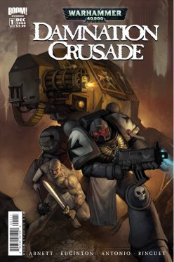
of him -- starting tomorrow with Boom! Studios new Warhammer
40K book.
Derek
McCaw:
So you tell me "I don't use flats, I mostly paint."
How would you
explain that to the average comics fan and how that makes
your work
stand out? JM
Ringuet: I think most colorists in the business
use what they call 'flats', which means on computer making
clean selections of the different elements of a page and
then fill this with colors, usually using the airbrush tool.
It's almost like classical airbrushing, making masks out
of paper to isolate the spots you want to color and spraying
paint on them. That technique results in a very clean but
a somewhat cold coloring in my opinion, something that can
feel overly digital.
I come
from a traditional approach and I like a more organic feel
to my coloring, something that looks like oil paint on a
canvas, gouache or watercolor on a piece of paper. It comes
a little bit from my training but mostly from my tastes
in art. I don't like things that are too clean, too careful.
I like accidents, spontaneity. I think that makes my coloring
stand out somehow.
Derek
McCaw: Any expounding on your process you want
to share is great.
JM
Ringuet: The way I approach a page is basically
the same a traditional painter will approach a canvas: lay
out a base color with some texture in it, then paint directly
over it emphasizing brush strokes, rendering textures and
light effects (values), usually in several layers more or
less transparent (when I say layers here I don't mean 'Photoshop
layers' but 'coats of paint'). I slowly build up the shapes,
sculpt out the form out of the shadows with expressive brustrokes.
That does not mean I don't like Photoshop effects or some
digital techniques that I gladly use but I try to mix them
in with a very traditional method.
I think
that works well (most of the time) with my style that I
want gritty, organic, realistic and dramatic. I'm don't
really like the subdued tones and delicacy that other artists
are good at. I'm a bit more brutal, contrasted and should
I dare say theatrical.
Derek
McCaw: What kind of training do you have?
JM
Ringuet: A few years in a bad art school where
I did not learn anything useful and years upon years of
practicing, trying things, agonizing, looking at painters'
work, reading art books and discovering the tricks of Photoshop.
Basically a lot of self training, which is good but also
frustrating at times.
I think
it's becoming easier now to self train if you look at all
the resources on the Web.
|
|
|
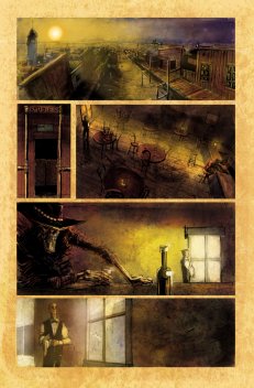
A page
from Death Comes To Dillinger.
pencils by Se7enhedd, colors by JM Ringuet
|
Derek
McCaw: What attracts you to a project?
Is it trust in the company, or
subject matter -- for example, the Dillinger books versus
your work for Boom!
JM
Ringuet: What attracts me are basically two things:
the trust I have in the people who are doing the project
and the trust they are going to put in me. Working with
people who want to hold your hand and tell you how something
should be colored (and I'm not talking about the color of
something but about the shade of that color – true
story) is useless. I like to work with people who want me
to bring something to the plate, to add to the art according
to my own sensibility.
Coloring
is mainly about making the work of the penciller/inker three-dimensional
and creating the mood the writer wants for the scene. It's
almost like being Director of Photography on a movie. I
want to be able to create while respecting other people
work and making it stand out.
I had
the chance to start coloring professionally on Death
Comes to Dillinger (from Silent Devil) with James Patrick,
the writer and creator, and he totally believed in me. He
told me the kind of style he wanted and let me go crazy
with it.
The
Death books are very organic, very expressionistic,
with a lot of shadows and half seen objects. Working on
that kind of project allowed me to experiment a lot and
just be very theatrical (too much in some cases). It's an
awesome experience, mostly because all the people involved
in the project are creators and stress creativity above
all else.
At Boom!
I started work on the Warhammer 40k monthly miniseries
that should be out at the end of this year and this is a
different kind of project in many ways. It is based on a
license (the famous tabletop and PC games) which means a
lot of attention has to be given to what has been established
before by other artists. This is also a more realistic looking
universe than the Death series, with less emphasis
on dramatic effects and more on realistic lighting.
Thankfully
the people at Boom (Ross Richie, Marshall Dillon and Mark
Powers my editor especially) completely trust me and never
interfered with the way I approach things. They liked my
painting from the get go and just wanted me to do it in
my own way. Games Workshop, owners of the Warhammer
40,000 license, also preferred an oil painting feel
to the coloring which works perfectly with my style. I think
the art on Warhammer 40k is going to please fans
of the original games as well as any comic fans of epic
sci-fi and gritty action.
|
|
|
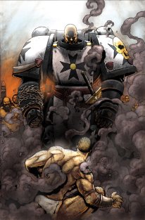
a
page from Warhammer 40K
|
Derek
McCaw: How do the individual projects affect your
approach?
JM
Ringuet: I really think coloring has to create
texture and mood for a story. Texture means using visual
elements that will pull the reader in the story.
For
example on Death it's about creating that dusty,
sepia, dirt-under-your-fingernails Italian western look.
On Warhammer 40k it's that hard edge metal, muddy,
smoky, cold and scarred feel.
Mood
is what the script commands, and color has to show it, express
the internal conflict of the characters, underline the action…
it's what music would do in a movie.
I plan
each project in that way, read the script carefully, immerse
myself in the universe it creates and then focus on ways
to build texture and express mood. Each project is completely
different in my mind.
Derek
McCaw: I've heard rumor you live in Europe
somewhere. If that's true, what
kind of challenges does that pose for work in the U.S.?
JM
Ringuet: I'm from Europe but I actually live in
China, in Suzhou, the Venice of China, for no other reason
that it is a beautiful place to live in. Chinese traditional
art is also starting to have a big influence on me.
I lived
before that all over the place, including eight years in
California. The only challenge I have working for US publishers
is the time difference: when you get up in the morning I
usually go to bed. That makes me feel like I'm living in
your future!
Derek
McCaw: What other forms of art are you
interested in?
JM
Ringuet: I'm interested in all forms of graphic
art and by extension about all arts ranging from architecture
to film making to calligraphy or industrial design. Besides
coloring I also work as an illustrator, concept artist and
even cover artist. I am very interested in graphic design.
Derek
McCaw: Who are some of your influences
in comics?
JM
Ringuet: In no order Simon Bisley, Ashley Wood,
Mike Mignola and Frank Miller (for their use of light),
Bill Sienkiewicz, Ben Templesmith, Katsuya Terada. I forget
a lot of people in that list.
|
|
|
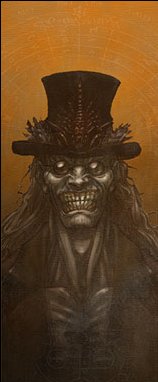
All Ringuet.
But let's hope that's not a
self-portrait.
|
Derek
McCaw: Do you have plans for penciling
or inking a book? Why focus on coloring?
JM
Ringuet: I do. I definitely do. I plan to pencil,
ink and color. I recently did two submissions for miniseries
that are still out there floating in the ether of mail piles
or cast in the netherworld of rejections. I am also preparing
new submissions with no less than three writers that should
happen in the very near future, and I have something going
with B. Clay Moore but he is a busy man.
I am
also in my free time (what free time?) working on my own
story ideas. So I'll definitely do a book sooner or later,
but I love coloring so I can see myself doing it for a long
time even if I draw at the same time.
For
update on my coming projects don't hesitate to check often
my blog at www.jmringuet.blogspot.com
Derek
McCaw: Where do you see the art of coloring
going?
JM
Ringuet: The first thing I see is coloring being
seen as important and relevant. Too often colorists are
ignored and not properly credited in previews or even in
books. My publishers are great: they always put my name
on the covers.
I think
also publishers, including the big two, are going to be
a lot more careful about the quality and style of coloring
they want for a given title. Color has to complement the
art and enhance it, not be a quick fix so the book 'is not
in black and white'. I think styles are going to become
much more important, and the lazy cookie cutter type of
coloring we see in too many titles is going to disappear.
Nobody
would like to buy different titles all drawn exactly in
the same way so why people buy titles that are all colored
the same? I think there is a lot of room for newcomers and
young artists with a clear strong style. We need it; we
need style and cool art. How many penciller names do you
know? How many colorist names do you know? This has to change.
So
we start with this one: JM Ringuet. Remember that name.
|
