|
The
Fanboy Planet Preview Spotlight 01/04/07
brought to you by FanboyPlanet.Comics
of Santa Clara
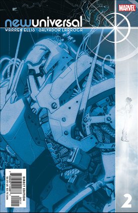
Newuniversal
#2
writer: Warren Ellis
artist: Salvador Larroca
Starbrand looks an awful lot like Josh Holloway.
Now that I've gotten that nagging observation out of the
way, we can move forward with an appreciation. Warren Ellis
had a double challenge before him with this project. Like
a lot of comics projects in the eighties (not all from Marvel),
the New Universe seemed good at first and has now become
the butt of a lot of jokes. Yet check out fandom and even
Kickers, Inc. seems to have fans.
Reviving the concept could have been - should have been
- a lose-lose proposition. Instead, Ellis nods to the old
New Universe, lets it still exist in fans' hearts, and moves
on to this new concept that may ultimately free up a lot
of continuity throughout all of Marvel's lines.
Yes, he also refines some concepts he created for other
companies. The "Superflow of Universe 555" (so clever of
Marvel not to start with Universe 1) looks an awful
lot like The Bleed from the Wildstorm Universe. As a result,
Nightmask might not be that far off from The Doctor from
The Authority. But this is as much a rethink of Ellis as
it is the New Universe, and so things just seem a little
bit clearer, even as they seem confusing.
Confused? Trust Ellis and you won't be.
As alternate Earths pass into the Superflow, the multiverse
responds by creating archetypal superbeings - among them
a Nightmask, a Starbrand and a Justice. Two of the three
share identities and attitudes with their previous counterparts,
while Nightmask barely resembles the character from the
eighties. For old fans, that's part of what makes this work
so well. Just when you think you have it all figured out,
Ellis throws in a curveball that hits like one of Justice's
shields.
Somewhere in there, too, is a Spitfire, who appears here,
but her mission this time around has changed drastically.
If the events here can be trusted, not even the Superflow
actually has all the answers.
Salvador Larroca also delivers art that will push him
up to the next level in fans' minds. In some places, it
rivals guys like Cassaday. Though he's obviously "casting"
his characters, it comes through in resemblance, not in
iconic poses like Greg Land. Yes, Starbrand is Holloway,
and John Tensen looks an awful lot like Bruce Willis in
places, but it's not static. It fits.
And so once again Marvel releases something that a few
years ago would have been a joke, and turns out to be more
than just a fun read. Newuniversal has bite and depth,
and it's not to late to get into it.
 |
Also on the
Stands:
Bullet Points
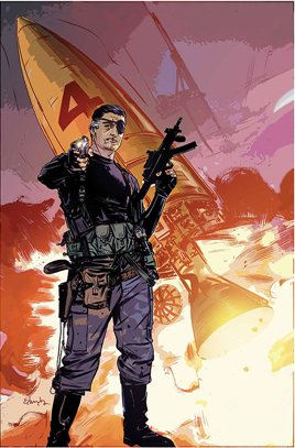
#3: Maybe J. Michael Straczynski has a larger plot at
work, but by this third issue, it's still disappointingly
repetitive. We get reminded again that the event that prevented
Captain America (but ended up creating Iron Man) also took
out Ben Parker. This time around, Steve Rogers figures it
out, as improbably not every recognizable character seems
to be just one or two degrees of separation from him. While
you might buy into Hulk and Iron Man having different identities,
it seems kind of strange that Nick Fury's secret identity
is
well, that would be telling, but it's also kind of reaching.
This could wrap up either very brilliantly or very ho-hum,
and it's hard to recommend.
The Incredible
Hulk #102: The problem with Greg Pak's skill as a storyteller
is that he really isn't right for comics, because
he keeps finding just the right ending for his arcs. After
this issue, I almost hate to see another because Pak has
so brilliantly and satisfyingly wrapped up the Hulk saga.
And in his hands, the Hulk became an epic. Of course, one
month from now, it's all going to come crashing down. It
can't end here, because Pak has deservedly made this into
an incredibly popular and pivotal book in the so-called
House of Ideas. Still, read this and think to yourself for
just a moment - if you really cared about the Hulk, you'd
let this be how he ends. Then realize, dammit, you still
want more. At least as long as Greg Pak writes it.
Ms. Marvel
#11: For those who may recall that Ms. Marvel has a
long history, this one's for you. Brian Reed has been doing
a really good job with the character, and kudos to the art
for daring to make Carol and her potential boyfriend here
somewhat older than we're used to seeing in comics. (As
in - they may be late thirties or even early forties, which
makes perfect sense.) The inking by Jon Sibal is a little
inconsistent, which actually is distracting from time to
time. But it's still a pretty good issue, even with Arana's
guest appearance. (Arana? ARANA? She's still around?)
 |
Spider-Man
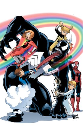
Power Pack #3: Holy crap, Marc Sumerak made Venom almost
kid-friendly. This mini-series continues to be well-written
fun for kids, without compromising Peter Parker and Mary
Jane. The only odd note gets struck by having the admittedly
funny Mini-Marvels tale in the back, which parodies Civil
War. That event is most assuredly not kid-friendly,
and it seems vaguely wrong to be luring kids in with this
parody. I may have to rethink this gateway drug theory about
kids' comics
Uncanny X-Men
#482: Billy Tan does one of the best renditions of the
Starjammers in that group's history. Overall, his art is
pretty chewy, and it's not easy to breeze over, for fear
you'll miss some crucial detail. Of course, Ed Brubaker
provides him with plenty, stepping into the rhythm of Claremont
and Byrne's days on the book. In revisiting the Shi'ar Empire,
this title may be neck deep in X-Men continuity (it reaches
back quite a ways - quite a ways), but the creative team
keeps it moving so you may not notice that you may not have
a clue what's going on, though you'll catch on to the soap
opera right quick.
X-23: Target
X #2: This can only end in tears. Well, you probably
knew that once you figured out that this book serves as
a prequel to NYX, where X-23 first appeared and wasn't
in too good a shape. The wonder in the writing by Craig
Kyle and Chris Yost is that X-23 comes off as a pretty normal
teen, except for that pheromone driven homicidal frenzy
thing. Actually, that's pretty normal, too. For the most
part, the art by Mike Choi and Sonia Oback is effective,
though they make Captain America look like a kid playing
dress-up, one of the problems inherent in leaning on a more
manga-esque style. Still, this book remains better than
it has a right to be.
Sight Unseen:
Civil
War #6: Oh, wait. No. I'm not going to see it this week.
Hey,
write to us and let us know what you think, or talk about
it on the forums!
|
