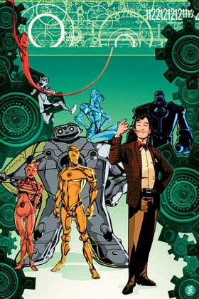
The Metal Men are back! And no one is more excited than
I am at the prospect. Well, maybe the people getting a regular
check for eight issues are more excited, and probably ASFR
enthusiasts with a thing for Platinum, and possibly Mr.
Universe, but other than that, no one.
I've always loved the idea of the Metal
Men but the reality has never lived up to the promise, until
perhaps in the recent 52. In that case the story
was more about Dr. Will Magnus, their creator, so it makes
sense the new miniseries by Duncan Rouleau (from ideas by
52 writer Grant Morrison) focuses on that character.
We get to see Dr. Magnus' earliest version
of the group of elemental robots, and some actual human
beings involved in his personal life including Dr. T. O.
Morrow. The addition of Morrow as Magnus' mentor in 52
was a stroke of genius, adding a depth to what was frequently
a stultifyingly dull characterization in the 1960's DC good-guy
scientist stereotype. Going off his meds and breaking the
mold of the lab-rat cum exposition device has done wonders
for the Doctor and it looks like Rouleau is working that
angle to best effect.
The depiction of the Metal Men themselves
has me a little less excited. They're played for laughs,
which can work well, but didn't in the first half of the
book. They're much funnier when they have the straight man
Will Magnus to play off of, as in the science fair scene.
And they're funnier still if you imagine the dialogue is
in French.
(I have no idea why this is true, but I
have noticed this with certain books. I have dubbed this
phenomenon "The Tintin Effect".)
The art is well suited to the story, a cartoony
pastiche for a semi-serious book. Faces are expressive,
poses are believable, and the tech looks cool with an metallo-organic
cast. The only letdown was the uninspired lettering, which
looks like your standard computer-created easy-to-read text.
I want something more for my favorite team of robots (sorry,
Mighty Orbots, you're a distant third). Each member of the
team should have distinctive lettering. In my imagination
it's an essential part of their characters.
I'm not going to try to justify my whimsy,
please use different fonts in future if you're going to
write use the Metal Men in a book. Somebody want to get
started on the MetalMen font collection? A quick look at
FontBook shows the name Magnus is available.


